|
|
|
@tomic
Administrator

USA
4607 Posts |
|
|
Snake
SFN Addict

USA
2511 Posts |
 Posted - 08/03/2003 : 13:09:03 [Permalink] Posted - 08/03/2003 : 13:09:03 [Permalink]


|
quote:
Originally posted by @tomic
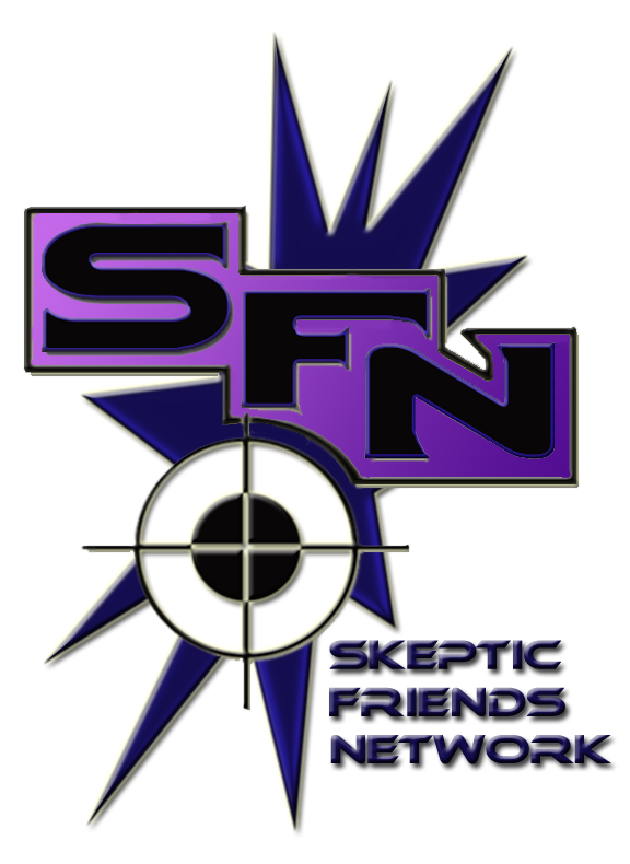
Entry #1
Are we supposed to critique them?
It was too large to see on my screen all at the same time but it's..... interesting! I very much like the purple . .
Is there some symbolism there? Purple being the color of royalty and skeptics are not common?
How many more entries have you recieved?
Aug. 16, 2003
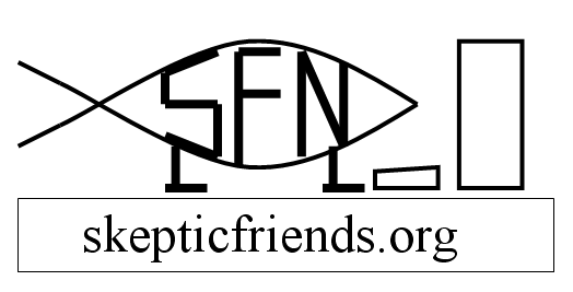
Entry #2
Hum! LOL, cute!
I hope after the contest we might know who desgined the various logos. I like people who have ideas like that.
Only thing I might say about the 'fish' is, I know someone who was selling a 'version' of the Darwin 'fish' and was threatened to be sued if they didn't stop. Although entry #2 here is not the same, I hope it doesn't cause any problems.
Nice idea. Both are good.
ps. one of my art teachter whom I really respect has an assingment when we critique each others work, a list of questions we have to ask and answer. One is, if the work was mine how would I change it?
So this is just a comment about the fish. I'd put an eye on it. Just a dot. And I'd make the front foot/leg bent and closer to the keyboard as if it was typing. Not that it doesn't look good now but it seems like it's just staring into the computer(not saying anything). I think it should look like it's communicating. But that's me!
|
| Edited by - Snake on 08/16/2003 21:39:45 |
 |
|
|
@tomic
Administrator
USA
4607 Posts |
|
|
filthy
SFN Die Hard

USA
14408 Posts |
Posted - 08/17/2003 : 04:23:40 [Permalink]
|
I like #2, the Darwin fish take-off. Simple and unmistakable; a not inconsiderable point in these days of extraordinary bullshit.
However, I agree with friend Snake; it needs work. Alas, having the artistic talent of Ithyostega, I have no coherent suggestions as to it's improvement.
I am a firm believer in using the KISS method for making such decisions. It never fails.
 |
"What luck for rulers that men do not think." -- Adolf Hitler (1889 - 1945)
"If only we could impeach on the basis of criminal stupidity, 90% of the Rethuglicans and half of the Democrats would be thrown out of office." ~~ P.Z. Myres
"The default position of human nature is to punch the other guy in the face and take his stuff." ~~ Dude
Brother Boot Knife of Warm Humanitarianism,
and Crypto-Communist! 
|
|
|
|
walt fristoe
SFN Regular

USA
505 Posts |
Posted - 08/17/2003 : 15:21:41 [Permalink]
|
| I like them both very much, but I'm afraid the fish (vesica piscis) will be mistaken for the xtian symbol, leading to confusion as to what kind of site this is. |
"If God chose George Bus of all the people in the world, how good could God be?"
Bill Maher |
|
|
|
gezzam
SFN Regular

Australia
751 Posts |
Posted - 08/17/2003 : 17:15:42 [Permalink]
|
Yeah, I'm with Walt on that one......if we go ahead with the t-shirts as Larry was talking about a while ago, I don't want to be mistaken for one of those crazy xtians....
I am autistic as opposed to artistic, so I will leave the design to others. |
Mistakes are a part of being human. Appreciate your mistakes for what they are: precious life lessons that can only be learned the hard way. Unless it's a fatal mistake, which, at least, others can learn from.
Al Franken |
|
|
|
Valiant Dancer
Forum Goalie

USA
4826 Posts |
Posted - 08/18/2003 : 11:59:14 [Permalink]
|
I'm voting for #1.
The #2 symbolism could tend to antagonize fundies. Sort of like poking a defenseless animal with a stick.
I might suggest that #1 have the word "Myth" in the crosshairs.
Jes my opinion. |
Cthulhu/Asmodeus when you're tired of voting for the lesser of two evils
Brother Cutlass of Reasoned Discussion |
|
|
|
NubiWan
Skeptic Friend

USA
424 Posts |
Posted - 08/19/2003 : 11:47:47 [Permalink]
|
Will go for a re-work of #2, it seems more consistant with SFN's message. The #1 entry might be confused with the right to arm bears movement...
Pull me finger |
 |
|
|
|
@tomic
Administrator
USA
4607 Posts |
Posted - 08/19/2003 : 21:18:38 [Permalink]
|
Thanks for all the input folks! We have a third entry. We can also use all sorts of variations for shirts and other products so if you have a good idea you could send in several versions of the same idea. Please keep in mind that lots of detail is lost when the image is reduced to about 80 pixels high so the logo picked will need to be readable at a small size.
So we may actually make all entries available for purchase. No idea is to small here!
I'm leaving tomorrow for a vacation so any entry not received before I leave tomorrow afternoon won't be posted untilmI return Sunday at the earliest!
@tomic |
Gravity, not just a good idea...it's the law!
Sportsbettingacumen.com: The science of sports betting |
|
|
|
Valiant Dancer
Forum Goalie
USA
4826 Posts |
Posted - 08/20/2003 : 13:00:48 [Permalink]
|
quote:
Originally posted by @tomic
Thanks for all the input folks! We have a third entry. We can also use all sorts of variations for shirts and other products so if you have a good idea you could send in several versions of the same idea. Please keep in mind that lots of detail is lost when the image is reduced to about 80 pixels high so the logo picked will need to be readable at a small size.
So we may actually make all entries available for purchase. No idea is to small here!
I'm leaving tomorrow for a vacation so any entry not received before I leave tomorrow afternoon won't be posted untilmI return Sunday at the earliest!
@tomic
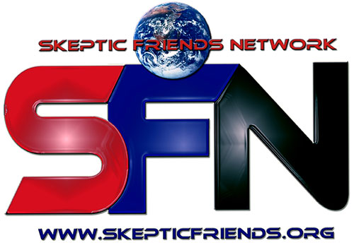
I'm gonna change my vote to #3. I think it expresses the community in a respectful way. |
Cthulhu/Asmodeus when you're tired of voting for the lesser of two evils
Brother Cutlass of Reasoned Discussion |
|
|
|
filthy
SFN Die Hard
USA
14408 Posts |
Posted - 08/20/2003 : 14:09:22 [Permalink]
|
I will reserve judgment until I see the noo too.
|
"What luck for rulers that men do not think." -- Adolf Hitler (1889 - 1945)
"If only we could impeach on the basis of criminal stupidity, 90% of the Rethuglicans and half of the Democrats would be thrown out of office." ~~ P.Z. Myres
"The default position of human nature is to punch the other guy in the face and take his stuff." ~~ Dude
Brother Boot Knife of Warm Humanitarianism,
and Crypto-Communist!
|
|
|
|
gezzam
SFN Regular
Australia
751 Posts |
Posted - 08/20/2003 : 15:42:54 [Permalink]
|
quote:
Originally posted by Valiant Dancer
quote:
Originally posted by @tomic
Thanks for all the input folks! We have a third entry. We can also use all sorts of variations for shirts and other products so if you have a good idea you could send in several versions of the same idea. Please keep in mind that lots of detail is lost when the image is reduced to about 80 pixels high so the logo picked will need to be readable at a small size.
So we may actually make all entries available for purchase. No idea is to small here!
I'm leaving tomorrow for a vacation so any entry not received before I leave tomorrow afternoon won't be posted untilmI return Sunday at the earliest!
@tomic
I'm gonna change my vote to #3. I think it expresses the community in a respectful way.
I'm with you on that one....I like it... |
Mistakes are a part of being human. Appreciate your mistakes for what they are: precious life lessons that can only be learned the hard way. Unless it's a fatal mistake, which, at least, others can learn from.
Al Franken |
|
|
|
Boron10
Religion Moderator
USA
1266 Posts |
Posted - 08/23/2003 : 08:42:23 [Permalink]
|
Comments from this part of the peanut gallery:
They are all good, in their own ways; unfortunately, I have specific criticisms of each.
Logo #1: I like the vibrance of this one, but what are we targeting? Ignorance?
Logo #2: This one is cute, with the minimalist representation of a computer to go with the fish. The only problem I have with it is that the fish thing is a little over done.
Logo #3: I like the colors, the planet, the blend of simple and detail, but it's a little too "Star Trek" looking for my taste. Maybe it's just the font, I am not sure.
With those comments, I will also comment that I have not been able to come up with anything at all, so I commend those who have.
Thanks, guys! Looking good! |
|
|
|
walt fristoe
SFN Regular
USA
505 Posts |
Posted - 08/23/2003 : 10:19:41 [Permalink]
|
I think I like #3 the best. It really seems to stand out, seems bold. But #1 would look better on a t-shirt.  |
"If God chose George Bus of all the people in the world, how good could God be?"
Bill Maher |
|
|
|
Snake
SFN Addict
USA
2511 Posts |
Posted - 08/23/2003 : 12:29:06 [Permalink]
|
quote:
Originally posted by @tomic
Entry #3
Yes, I agree with other comments, they all are nice. I hope they will inspire more entries.
Just one thing that I think #3 could do, there's something about the 'N', too wide or maybe it's the black but my eye keeps going there instead of all around the design. If it were mine I'd compact the N just a tinsey bit or put it closer to the F, like the S is, if not experiment with other colors. (which I'm sure the person already did)
But on the whole #3 looks very logoish. I like it. |
|
|
|
@tomic
Administrator
USA
4607 Posts |
Posted - 08/24/2003 : 18:45:48 [Permalink]
|
I really like those Entry 3 revisions but agree about the font. Sometimes a less arty font is better with a more subtle application of the drop shadow. Often less is more but I really love the idea. I would maybe use the same font and color you use for the SFN for the entire word maybe.
I could see myself buying a shirt for each of several of these!
@tomic |
Gravity, not just a good idea...it's the law!
Sportsbettingacumen.com: The science of sports betting |
|
|
 |
|